Supporting patients
with early, accessible cost assurance
Sprint Virtual Assistant
When patients weren't sure they could afford a test, the cost alone was often enough to make them walk away. And for those who tried to get help, the path was calling in or faxing a paper form, a manual process never built for this scale. We replaced it with a self-service flow patients complete on their phone, cutting manual entry and speeding up every application.
Where
Invitae/Labcorp
When
2025
Timeline
4 Months
Platform
Web, Mobile
Team
PM, Developers, Customer Service, Billing, Compliance

The Challenge
Help was there. Most patients never got to it.
At the point of care, a patient learns she may qualify for help paying for an expensive genetic test, one she's not even sure insurance will cover. To find out for certain, she needs to fill out a paper form and email or fax it in and for most thats where it ends.
From there, someone on our team had to retype every field into a spreadsheet by hand, a manual process built for a much smaller program and never designed for this volume. It wasn't just friction for the patient. It meant more work for customer service too.
Only about 29% of patients who are eligible for assistance actually learn about, apply for, and receive these benefits.
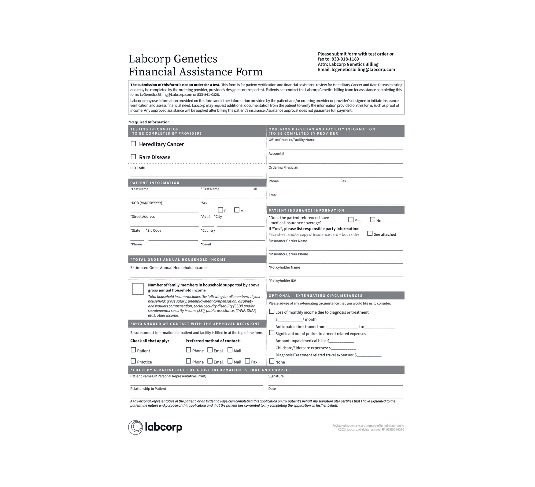
Patients had to fill out a paper form and email or fax.
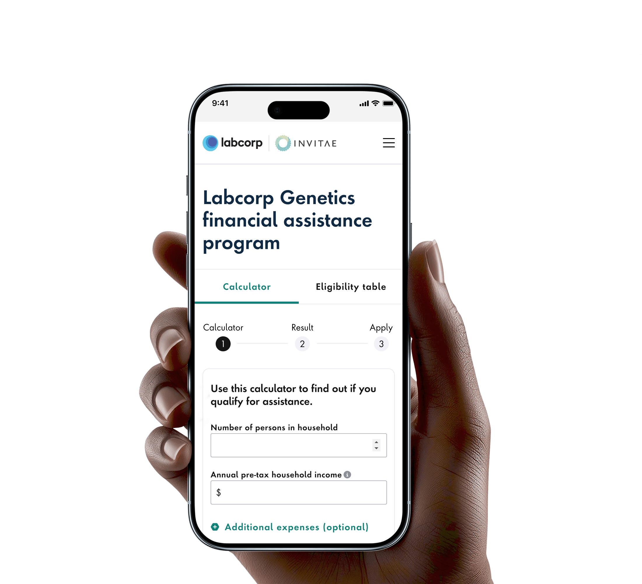
Patients pre-qualify and apply all online.
Reassurance providers couldn't give
Providers want to reassure patients they won't face a surprise bill for an expensive test. But today, a cost estimate only appears after the order is already placed, and most patients don't know whether they qualify for help or how much they'd save. Without a simple way to check eligibility on the spot, patients are left uncertain, and providers can't offer real reassurance during the visit, right when it matters most.

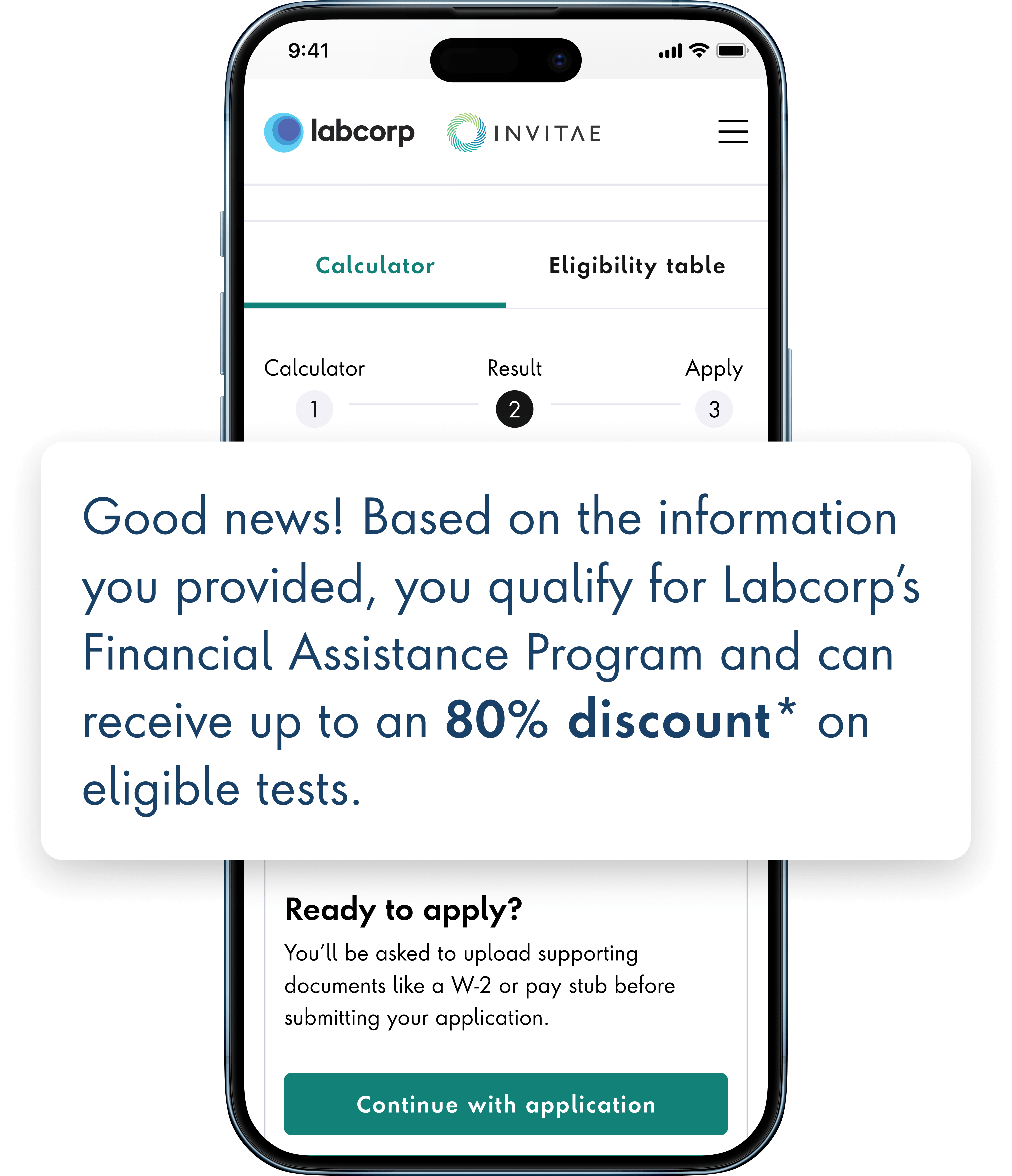
Assurance Before Commitment
A genetic test is a real financial commitment, and most patients want to know where they stand before they're asked to decide anything. That's why the calculator needed to be open to anyone, no account required, so people could get a real answer before committing to a test. But open didn't mean unaccountable. Compliance still needed a defensible, auditable record behind every calculation, whether it came from a patient online or a rep on the phone.
The Process
Listen and Align before Design
Before we touched the interface, we needed to understand what applying for help actually felt like for the patient, not just what the business assumed about it. People are often already navigating a stressful health decision, and confusion about cost only adds to it. That understanding shaped every choice that followed, and we made a point of coming back to real patients later to test whether we'd actually gotten it right.
We ran discovery sessions with billing and operations to map the full process. We looked at what reassurance patients actually needed along the way, what the guest experience had to deliver on its own, and how that information would flow into our internal system to log the record and apply the discount.
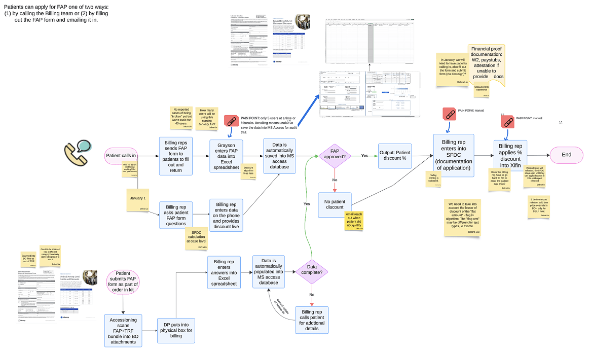
Process map we created as a group during alignment workshop.
Goals & Objectives
Goals & Objectives

Workflow Efficiency
Enhance the FAP workflow to ensure the Billing team can manage the increased load efficiently and help maintain expected turnaround times with a high level of customer satisfaction.

Application Volume
Ability for workflow to support an increase in applications in response to recent billing changes and a growing demand for support. Improve accessibility to ensure more eligible patients can easily apply and reduce financial barriers to getting tested.

Improving Billing Support
Make it easier for patients to understand their options and directly access billing support when needed.

Stability & Scalability
Enhance system stability and scalability, allowing more reps to access the form simultaneously without crashes or slow downs. Improve backend performance to minimize workflow disruptions
The Listener
One example of the 4 mindsets we came up with is the Listener.
Key behaviors:
- Recording feeling and emotion
- Serving information
- Confirming information
- Navigating to relevant information
This mindset falls in the passive + feeling quadrant of the mindset chart.
The VA doesn't operate solely in one Mindset or another, but shifts between them as the customer needs fluctuate.
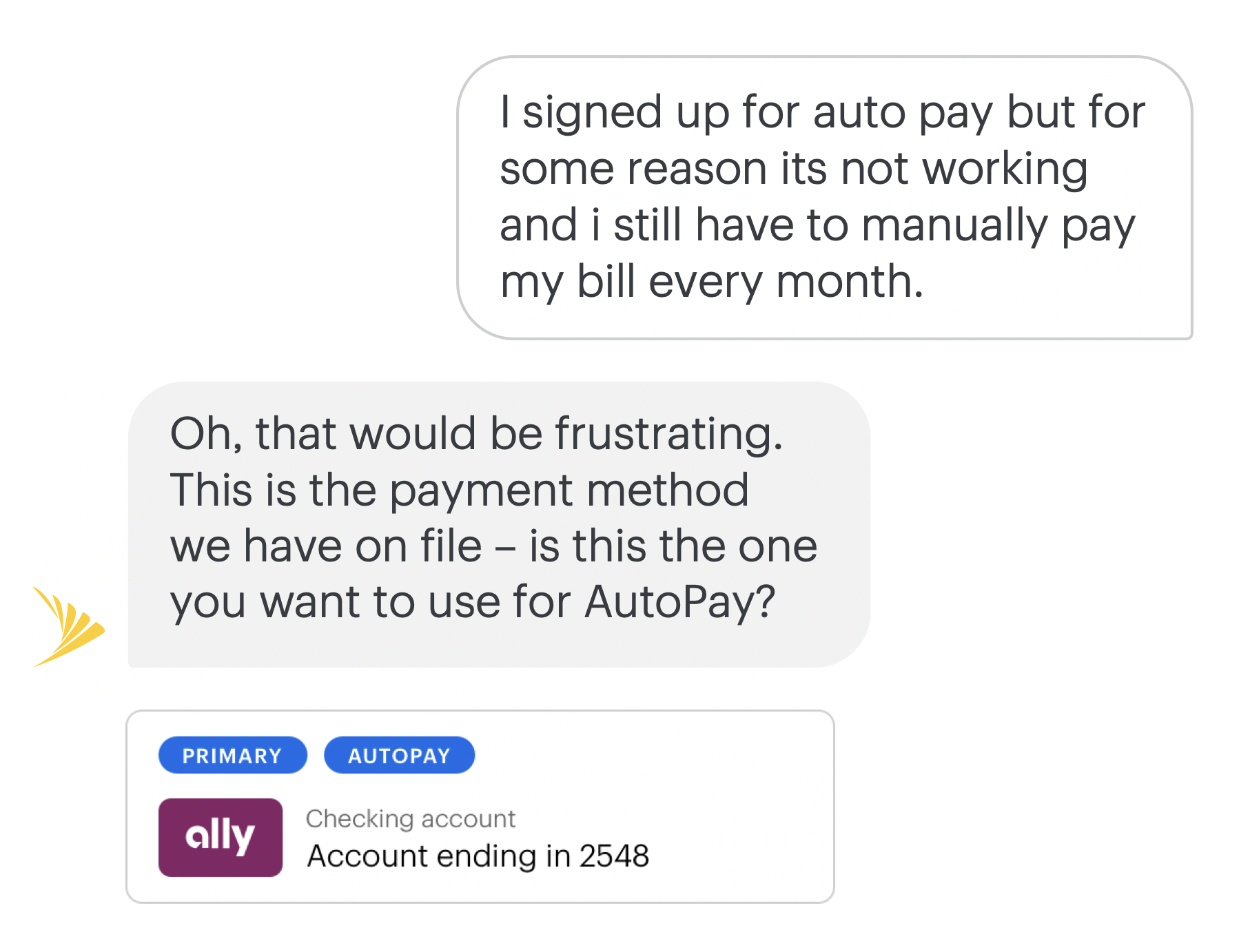
It's Just a Conversation
with a Robot
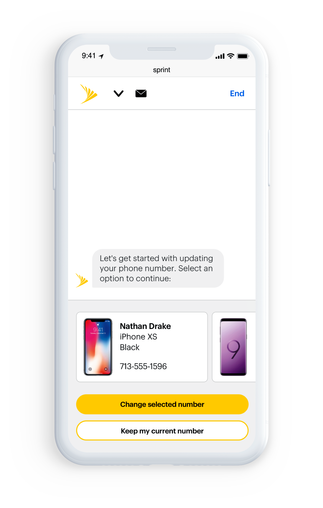
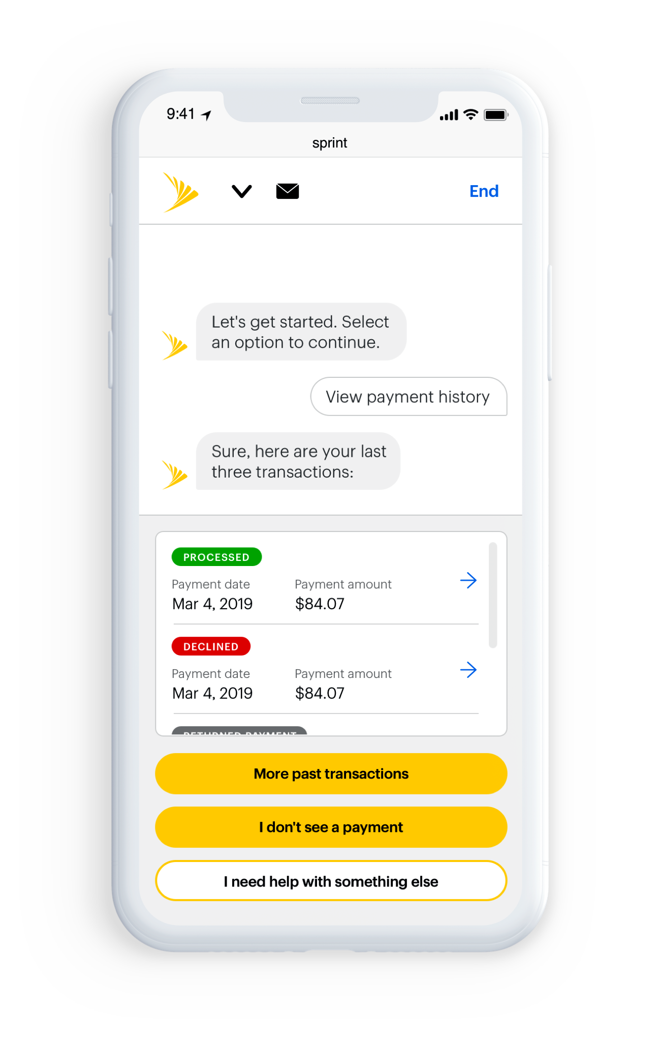
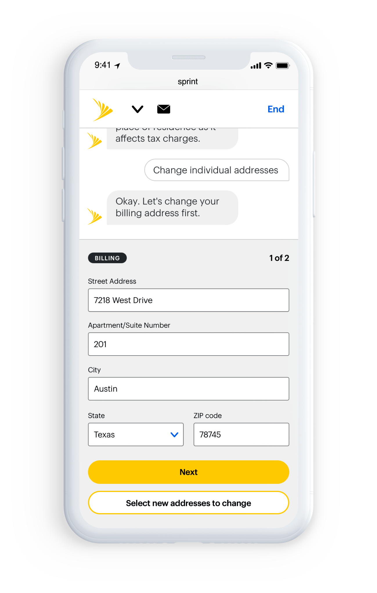
The backbone of the VA interaction is a pattern of question and response, a back-and-forth between the customer and the VA. All forms and responses should be reflective of and informed by this interaction pattern. The Sprint VA is not a human, and doesn't pretend to be. It should avoid patterns that would confuse the customer and imply they're chatting with anything other than the Virtual Assistant.
.
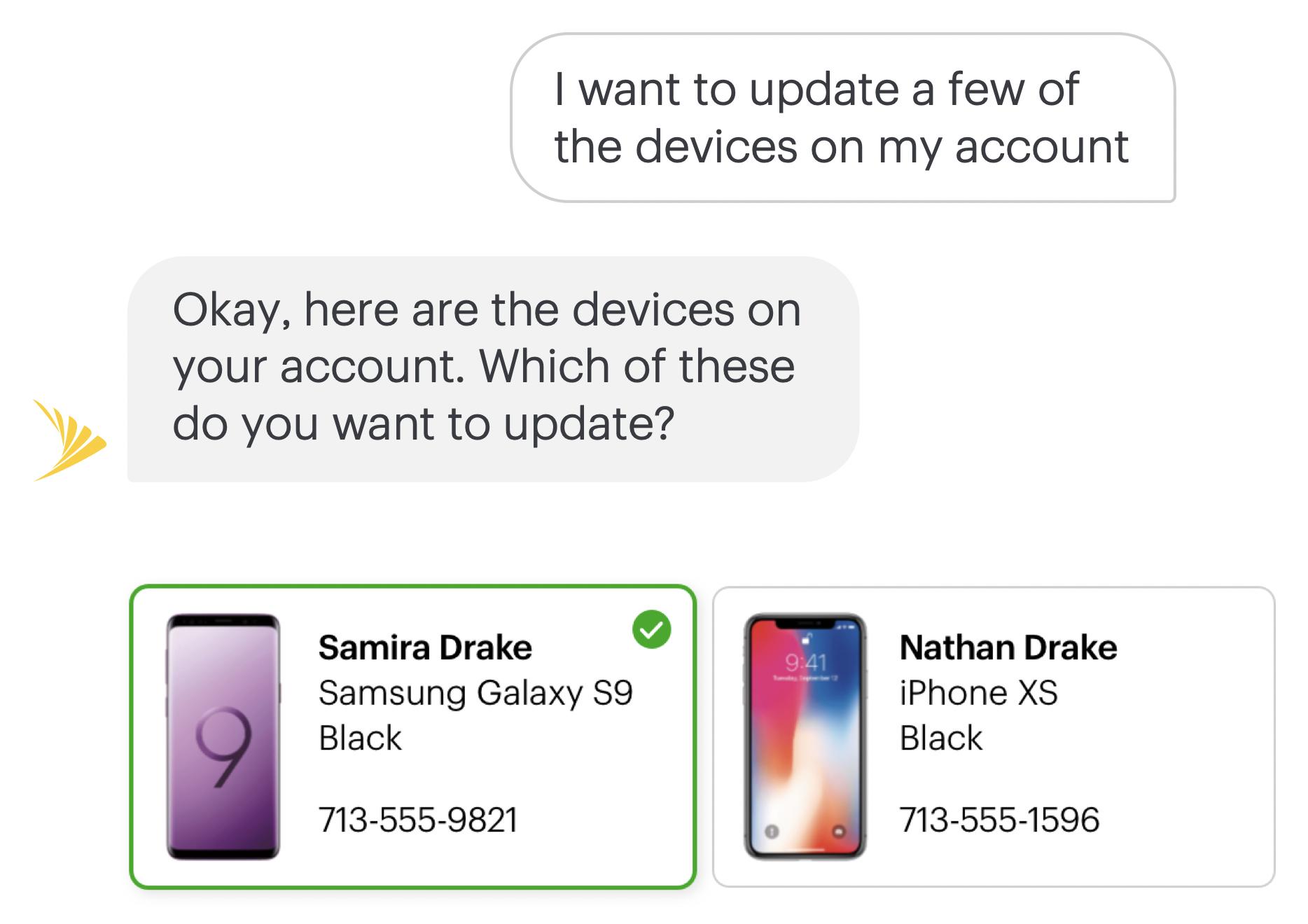
Designing a Response
Creating a VA response involves three broad steps.
Designing a Response
Creating a VA response involves three broad steps.
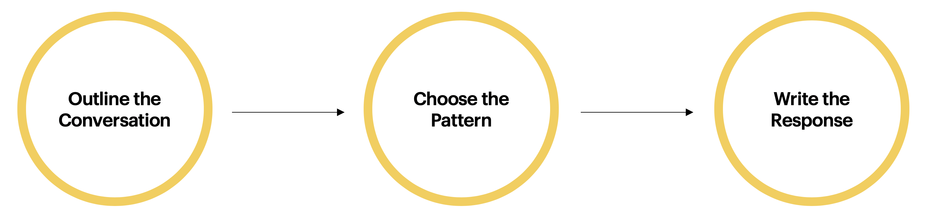
STEP 1
Evaluate the customer's need and determine where it fits into a specific business process.
STEP 2
Determine the best elements for the response, then choose a strategy for how the VA responds (e.g. displaying information or collecting information).
STEP 3
Translate patterns and content into a conversational chat format, applying the VA's personality.
STEP 3
Hey there, this is the default text for a new paragraph. Feel free to edit this paragraph by clicking on the yellow edit icon. After you are done just click on the yellow checkmark button on the top right. Have Fun!
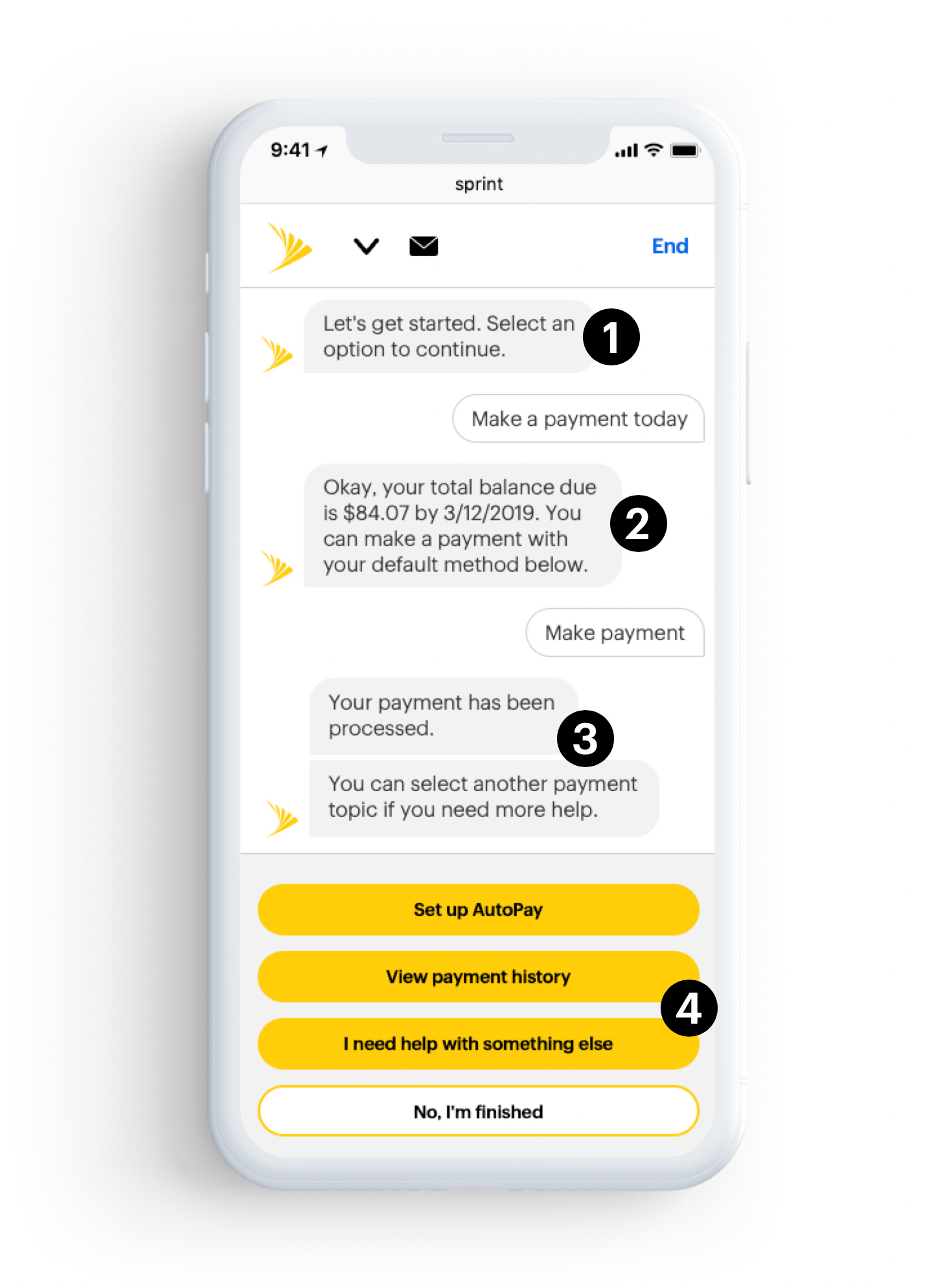

1. Greeting/Confirmation
1. Greeting/Confirmation
Use a simple greeting followed by a confirmation to let the customer know the VA is aware of their intent.
Use a simple greeting followed by a confirmation to let the customer know the VA is aware of their intent.

2. Confirmation/Next Steps
Provide feedback message to affirm the users intention. Respond with the next best logical step using a probability algorithm. Provide user responses to quickly confrim next step.

3. Wrap-Up
Final response to confirm completed task. Provide users with additional responses based on additonal common tasks.

4. Calls to Action (CTA)
Quick response CTA(s) to save time from typing in responses. This limits the responses to the current actions per task, as the system learns and builds new ones. Always provide a way forward and a way back.
Style Guide & Component Library
Style Guide & Component Library
To ensure visual consistency consistency through the lifecycle of the product and to make global changes to individual design components a visual style guide and Sketch component library was created. The guide and library follow the concept of atomic design principles. According to Atomic Design every interface is made out of atomic elements that each offer only a single function, e.g. input fields, buttons, checkboxes etc. In this methodology these atoms can be combined to create larger groupings or components of an interface. These building blocks serve to create designs for various screens. A shared Sketch symbol library and Atomic Design principles help teams easily maintain visual consistency in their collaborative designs.

Using the Library
We utilized Sketch and several plugins to manage the style guide and the component library and to handoff designs to the development team. Invision Craft was used to sync screens to an Invision prototype to present and stress test our designs with the client. The Anima Toolkit plugin was used to create dynamic elements and layouts using their pin, padding and new "stack" feature. Then Zeplin was used to import screens directly from Sketch into Zeplin for the developers to inspect screen design specifications like font information, paddings, margins and to easily export various assets.
TonyMDesign
TonyMDesign
© 2025
© 2018
Austin, TX
Austin, TX